Using Jamovi: Introduction
28 Mar 2018Jamovi is a new piece of software that makes running most basic analyses quicker, easier, and better. Shockingly, this is a free program based on the R programming language. It has the goal of “free and open software to bridge the gap between researcher and statistician.” Needless to say, it is worth taking a look if you are doing some basic analyses and don’t want to pay for SPSS or SAS, or learn how to use R. It provides informative tables and neat visuals.
This post is part of a series–demonstrating the use of Jamovi–mainly because some of my students asked for it. Notably, this is using version 0.8.6.0.
Data
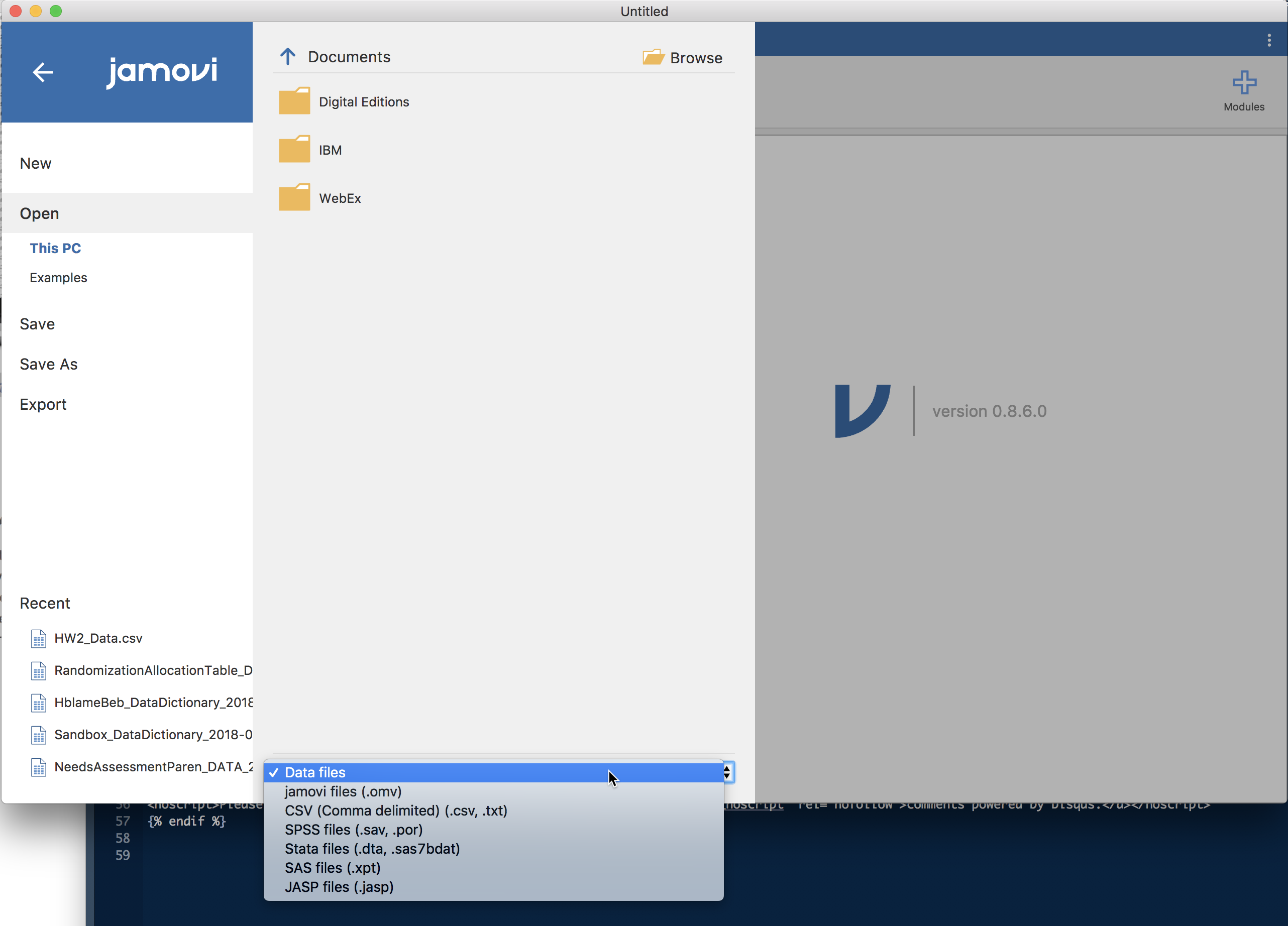
Getting data into Jamovi is fairly straightforward if your data are in CSV, Excel, SPSS, Stata, and others. To import existing data, click on the upper left corner of Jamovi on the three horizontal lines. This opens up what is shown in the following screen shot. From here, you find the data file on your computer, select it, and select “open”.
From here, we can change the variable types by double clicking on the variable name. The bubbles or ruler tell us what kind of variable it is.

Now that these are prepped, much of the data cleaning is much like you do in Microsoft Excel (although I recommend cleaning in a program other than Jamovi since at this point you can only do basic adjustments in Jamovi).
At the top of Jamovi’s GUI, there are a number of tabs that are different analyses that you can do, including Exploration, T-Tests, etc. For this demonstration, we are going to show the Exploration tab which is for obtaining descriptive statistics and exploratory visualizations.
Exploration in Jamovi
The following screenshot shows what you see once you click on Exploration > Descriptives. Our variables are listed and we can pull them into “Variables” or “Split by”. The ones we put into “Variables” will automatically be summarized in the table in the output (on the right of the screen). If we want those statistics by a grouping factor, we can put that variable into “Split by”.


There’s a drop-down menu below this called “Statistics”. In here, we can request different summary statistics, including for things like the skew, kurtosis, the standard deviation, variance, standard error of the mean, and others.
Below that drop-down menu there is one more, called “Plots”. This is a great menu because you get R quality graphics with simple point’n click.

Since our “Variables” are all continuous (except for the split by variable), we can only do Histograms and Box Plots in this case. But, because we have a split by variable, we get the boxplots stratified by that variable. In this case, we get a boxplot for each group. In addition, although it isn’t shown, there is also a box plot for pretest, as that is another variable listed in our “Variables”.
If you don’t like the default look of the figures, you can click on the three vertical dots in the upper right-hand corner to see a menu that gives you options regarding a number of things including plot default options.
Conclusions
This has been a quick introduction to Jamovi. Leave any comments or questions below!