class: center, middle, inverse, title-slide # Data Visualization ## Cohen Chapter 2 <br><br> .small[EDUC/PSY 6600] --- # Always plot your data first! <br> .center[.Huge["Always." - Severus Snape]] <br> -- ### Why? .large[ - .dcoral[Outliers] and impossible values - Determine correct .nicegreen[statistical approach] - .bluer[Assumptions] and diagnostics - Discover new .nicegreen[relationships] ] --- background-image: url(figures/fig_misleading_graph1.png) background-position: 90% 60% background-size: 500px # The Visualization Paradox <br> .pull-left[.large[ - Often the .dcoral[most informative] aspect of analysis - .nicegreen[Communicates] the "data story" the best - Most abused area of quantitative science - Figures can be *very* .bluer[misleading] ]] .footnote[[Misleading Graphs](https://venngage.com/blog/misleading-graphs/)] --- background-image: url(figures/fig_misleading_graph1_fixed.png) background-position: 50% 80% background-size: 700px # Much better --- # Keys to Good Viz's .pull-left[.huge[ - .dcoral[Graphical method] should match .dcoral[level of measurement] - Label all axes and include figure caption - .nicegreen[Simplicity and clarity] - .bluer[Avoid of ‘chartjunk’] ]] -- .pull-right[.huge[ - Unless there are 3 or more variables, avoid 3D figures (and even then, avoid it) - Black & white, grayscale/pattern fine for most simple figures ]] --- # Data Visualizations .huge[Takes practice -- try a bunch of stuff] -- ### Resources .large[.large[ - [Edward Tufte's books](https://www.edwardtufte.com/tufte/books_vdqi) - ["R for Data Science"](http://r4ds.had.co.nz/) by Grolemund and Wickham - ["Data Visualization for Social Science"](http://socviz.co/) by Healy ]] --- # Frequency Distributions .pull-left[ .huge[.bluer[Counting] the number of occurrences of unique events] - Categorical or continuous - just like with `tableF()` and `table1()` ] .pull-right[ .large[ Can see .dcoral[central tendency] (continuous data) or .dcoral[most common value] (categorical data) ] .large[Can see .nicegreen[range and extremes]] ] ``` ────────────────────────────────────────────────────── x Freq CumFreq Percent CumPerc Valid CumValid 1 265 265 26.50% 26.50% 27.32% 27.32% 2 222 487 22.20% 48.70% 22.89% 50.21% 3 242 729 24.20% 72.90% 24.95% 75.15% 4 241 970 24.10% 97.00% 24.85% 100.00% Missing 30 1000 3.00% 100.00% ────────────────────────────────────────────────────── ``` --- # Frequencies and Viz's Together ❤️ .pull-left[ ### Bar Graph <!-- --> ] -- .pull-right[ ### Histogram <!-- --> ] ??? What differences do you notice between them? ##### Bar - Do NOT touch each other - Begin and terminate at real limits - Centered on the value - Height = frequency ##### Histogram - Touch each other - Begin and terminate at real limits - Centered on interval midpoint - Height = frequency - Interval size or ‘bin’ determines shape - Too narrow or too wide problematic - Useful for checking distributional assumptions --- # What does DISTRIBUTION mean? ### The way that the data points are scattered -- .pull-left[.large[.large[ **For .dcoral[Continuous]** - General shape - Exceptions (outliers) - Modes (peaks) - Center & spread (chap 3) - Histogram ]]] .pull-right[.large[.large[ **For .nicegreen[Categorical]** - Counts of each - Percent or Rate (adjusts for an ‘out of’ to compare) - Bar chart - Pie chart - avoid! ]]] --- class: inverse, center, middle # Let's Apply This To the Inho Dataset --- background-image: url(figures/fig_inho_data_desc.png) background-position: 50% 80% background-size: 800px # Reminder --- # Read in the Data ```r library(tidyverse) # the easy button library(rio) # read in Excel files library(furniture) # nice tables data_raw <- rio::import("Ihno_dataset.xls") %>% dplyr::rename_all(tolower) # converts all variable names to lower case ``` -- ### And Clean It ```r data_clean <- data_raw %>% dplyr::mutate(majorF = factor(major, levels= c(1, 2, 3, 4, 5), labels = c("Psychology", "Premed", "Biology", "Sociology", "Economics"))) %>% dplyr::mutate(coffeeF = factor(coffee, levels = c(0, 1), labels = c("Not a regular coffee drinker", "Regularly drinks coffee"))) ``` --- # Frequency Distrubutions .pull-left[ ```r data_clean %>% furniture::tableF(majorF) ``` ``` ## ## ───────────────────────────────────────── ## majorF Freq CumFreq Percent CumPerc ## Psychology 29 29 29.00% 29.00% ## Premed 25 54 25.00% 54.00% ## Biology 21 75 21.00% 75.00% ## Sociology 15 90 15.00% 90.00% ## Economics 10 100 10.00% 100.00% ## ───────────────────────────────────────── ``` ] .pull-right[ ```r data_clean %>% furniture::tableF(phobia) ``` ``` ## ## ───────────────────────────────────── ## phobia Freq CumFreq Percent CumPerc ## 0 12 12 12.00% 12.00% ## 1 15 27 15.00% 27.00% ## 2 12 39 12.00% 39.00% ## 3 16 55 16.00% 55.00% ## 4 21 76 21.00% 76.00% ## 5 11 87 11.00% 87.00% ## 6 1 88 1.00% 88.00% ## 7 4 92 4.00% 92.00% ## 8 4 96 4.00% 96.00% ## 9 1 97 1.00% 97.00% ## 10 3 100 3.00% 100.00% ## ───────────────────────────────────── ``` ] --- # Frequency Viz's .Huge[For viz's, we will use `ggplot2`] <br> .huge[This provides the most powerful, beautiful framework for data visualizations] -- .large[.large[ - It is built on making .dcoral[layers] - Each plot has a .nicegreen["geom"] function - e.g. `geom_bar()` for bar charts, `geom_histogram()` for histograms, etc. ]] --- # Bar Charts .pull-left[ ```r data_clean %>% ggplot() + aes(majorF) ``` <!-- --> ] -- .pull-right[ ```r data_clean %>% ggplot() + aes(majorF) + geom_bar() ``` <!-- --> ] --- # Bar Charts ```r data_clean %>% ggplot() + aes(coffee) + geom_bar() ``` 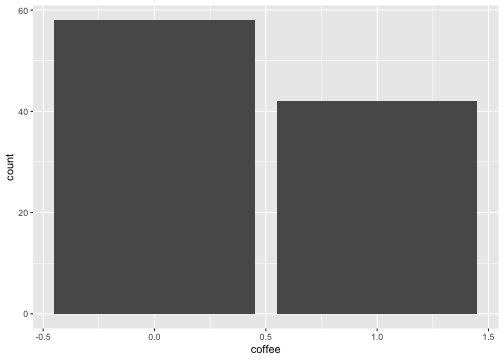<!-- --> --- # Histograms ```r data_clean %>% ggplot() + aes(phobia) + geom_histogram() ``` 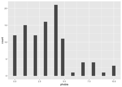<!-- --> --- # Histograms (change number of bins) ```r data_clean %>% ggplot() + aes(phobia) + geom_histogram(bins = 8) ``` 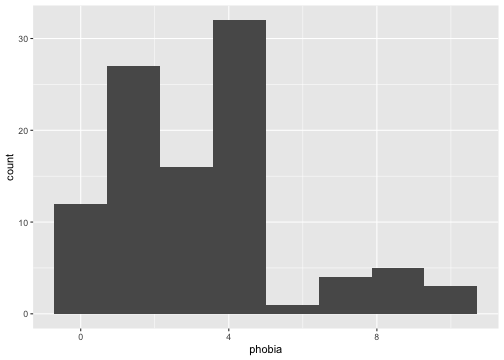<!-- --> --- # Histograms (change bins to size 5) ```r data_clean %>% ggplot() + aes(phobia) + geom_histogram(binwidth = 5) ``` 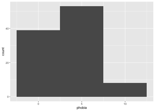<!-- --> --- # Histograms ```r data_clean %>% ggplot() + aes(mathquiz) + geom_histogram(binwidth = 4) ``` 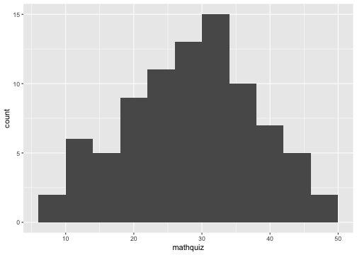<!-- --> --- # Histograms -by- a Factor (columns) ```r data_clean %>% ggplot() + aes(mathquiz) + geom_histogram(binwidth = 4) + facet_grid(. ~ coffeeF) ``` 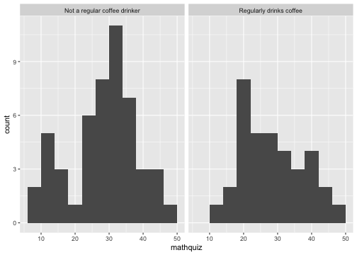<!-- --> --- # Histograms -by- a Factor (rows) ```r data_clean %>% ggplot() + aes(mathquiz) + geom_histogram(binwidth = 4) + facet_grid(coffeeF ~ .) ``` 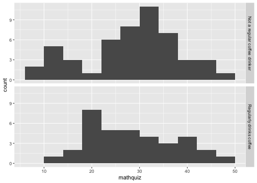<!-- --> --- # Deciles (break into 10% chunks) ```r data_clean %>% dplyr::pull(statquiz) %>% quantile(probs = c(.10, .20, .30, .40, .50, .60, .70, .80, .90)) ``` ``` ## 10% 20% 30% 40% 50% 60% 70% 80% 90% ## 4.0 6.0 6.0 7.0 7.0 8.0 8.0 8.0 8.1 ``` --- # Deciles - with missing values ```r data_clean %>% dplyr::pull(mathquiz) %>% quantile(probs = c(.10, .20, .30, .40, .50, .60, .70, .80, .90)) ``` `Error in quantile.default(., probs = c(0.1, 0.2, 0.3, 0.4, 0.5, 0.6, 0.7, : missing values and NaN's not allowed if 'na.rm' is FALSE` --- # Deciles - `na.rm = TRUE` ```r data_clean %>% dplyr::pull(mathquiz) %>% quantile(probs = c(.10, .20, .30, .40, .50, .60, .70, .80, .90), na.rm =TRUE) ``` ``` ## 10% 20% 30% 40% 50% 60% 70% 80% 90% ## 15.0 21.0 25.2 28.0 30.0 32.0 33.8 37.2 41.0 ``` --- # Quartiles (break into 4 chunks) ```r data_clean %>% dplyr::pull(statquiz) %>% quantile(probs = c(0, .25, .50, .75, 1)) ``` ``` ## 0% 25% 50% 75% 100% ## 1 6 7 8 10 ``` --- # Percentiles ```r data_clean %>% dplyr::pull(statquiz) %>% quantile(probs = c(.01, .05, .173, .90)) ``` ``` ## 1% 5% 17.3% 90% ## 2.98 3.00 5.00 8.10 ``` --- class: inverse, center, middle # Questions? --- class: inverse, center, middle # Next Topic ### Center and Spread