class: center, middle, inverse, title-slide # Reviewing Tables and <code>ggplot2</code> ## 😃 ### Tyson S. Barrett --- # Data For these slides, the activities, and examples we will use the "Office_Parks" data set. - Contains ficticious data on both *The Office (U.S.)* and *Parks and Recreation* television shows - Longitudinal (two time points) and nested (within show) - Currently in wide format -- Data can be downloaded from: [tysonstanley.github.io](https://tysonstanley.github.io/assets/Data/OfficeParks.csv) --- class: center, middle, inverse # Review of Beautiful Tables # and # `ggplot2` 📊 --- # Load the Data ```r d <- read.csv("OfficeParks.csv") ``` <div id="htmlwidget-c91213ccd748edfc1e73" style="width:100%;height:auto;" class="datatables html-widget"></div> <script type="application/json" data-for="htmlwidget-c91213ccd748edfc1e73">{"x":{"filter":"none","extensions":["Buttons","KeyTable","Responsive","Scroller"],"fillContainer":false,"data":[["1","2","3","4","5","6","7","8","9","10","11","12","13","14","15","16","17","18","19","20","21","22","23","24","25","26","27","28","29","30","31","32","33","34","35","36","37","38"],[1,2,3,4,5,6,7,8,9,10,11,12,13,14,15,16,17,18,19,20,21,22,23,24,25,26,27,28,29,30,31,32,33,34,35,36,37,38],["Michael","Pam","Jim","Dwight","Stanley","Phyllis","Creed","Meredith","Oscar","Angela","Kevin","Kelley","Ryan","Toby","Andy","Jan","April","Andy","Leslie","Ron","Tom","Donna","Ben","Chris","Gary (Larry, Jerry)","Jean Ralphio","Mona Lisa","Ann","Kyle","The Other Ron","Craig","Shauna Molwaytweep","Councilman Jamm","Ethel","Councilman Howser","Tammy","Tammy II","Diane"],[2,3,3,5,4,4,1,3,5,4,2,3,2,4,3,4,1,1,5,3,2,2,5,4,3,1,1,5,3,null,null,4,null,2,5,null,5,null],[3,8,8,6,7,8,2,5,7,5,6,5,2,1,5,6,6,2,8,8,5,7,8,6,5,1,1,8,5,null,null,6,null,5,6,null,5,null],[8,7,8,8,4,4,4,4,7,7,2,5,5,6,7,6,4,2,7,7,5,6,5,8,3,2,1,8,2,7,6,5,5,2,6,5,3,7],[0,1,1,0,1,1,0,0,0,0,0,0,0,0,0,1,1,1,0,0,0,0,0,0,1,0,0,0,1,0,0,0,1,0,null,0,0,1],[0,1,0,0,0,1,0,1,0,1,0,1,0,0,0,1,1,0,1,0,0,1,0,0,0,0,1,1,1,0,1,0,1,0,1,0,0,0],["White","White","White","White","Black","White","White","White","Mexican American","White","White","Indian","White","White","White","White","Mexican American","White","White","White","Indian","Black","White","White","White","White","White","White","White","White","White","White","White","White","Black","White","White","White"],[55,35,70,70,70,70,45,40,50,50,45,40,40,60,60,80,25,15,45,55,35,70,65,70,40,10,10,40,35,35,35,45,90,40,60,55,40,90],[0,2,2,0,1,0,0,1,0,0,0,0,0,0,0,0,0,0,0,0,0,0,0,0,0,0,0,0,null,0,0,0,0,0,0,0,0,2],[1,0,0,0,0,0,1,1,0,0,0,0,1,0,0,0,1,0,0,0,0,0,0,0,0,1,1,0,0,1,0,0,0,0,0,0,0,0],[1,1,1,1,1,1,1,2,1,1,1,1,1,1,1,1,1,1,1,1,1,1,1,1,1,2,2,1,1,1,1,1,1,1,1,1,1,1],[1,1,1,0,0,1,0,0,0,0,0,0,0,0,0,0,0,1,0,1,0,0,0,1,0,0,0,0,0,0,0,0,0,0,0,0,0,0],[15,8,5,12,13,10,null,13,10,9,14,17,11,19,16,10,15,7,5,5,12,10,9,2,10,15,15,9,17,null,null,17,null,10,8,null,15,null],[5,2,3,4,1,1,3,4,3,4,3,2,2,1,3,1,18,15,10,5,10,8,10,14,16,19,19,10,15,null,null,10,null,10,4,null,15,null],[4,3,5,7,5,3,1,4,7,4,3,5,5,5,6,2,1,3,7,3,3,1,5,4,3,2,0,6,3,3,4,7,1,4,7,4,8,5],[4,8,10,7,8,10,1,7,8,7,6,6,4,3,7,2,6,5,9,7,6,9,10,7,7,3,4,9,6,5,4,7,3,7,6,5,6,4],[16,9,5,13,13,11,13,12,10,9,14,16,11,18,16,17,15,7,5,4,13,12,9,1,10,18,16,8,17,5,15,16,18,10,6,5,15,8],[6,1,2,4,0,0,2,4,2,4,2,1,1,0,2,0,25,20,13,6,13,10,13,19,22,26,26,13,20,7,17,13,19,13,4,5,20,4],["The Office","The Office","The Office","The Office","The Office","The Office","The Office","The Office","The Office","The Office","The Office","The Office","The Office","The Office","The Office","The Office","Parks and Rec","Parks and Rec","Parks and Rec","Parks and Rec","Parks and Rec","Parks and Rec","Parks and Rec","Parks and Rec","Parks and Rec","Parks and Rec","Parks and Rec","Parks and Rec","Parks and Rec","Parks and Rec","Parks and Rec","Parks and Rec","Parks and Rec","Parks and Rec","Parks and Rec","Parks and Rec","Parks and Rec","Parks and Rec"],["March 24, 2005","March 24, 2005","March 24, 2005","March 24, 2005","March 24, 2005","March 24, 2005","March 24, 2005","March 24, 2005","March 24, 2005","March 24, 2005","March 24, 2005","March 24, 2005","March 24, 2005","March 24, 2005","March 24, 2005","March 24, 2005","April 9, 2009","April 9, 2009","April 9, 2009","April 9, 2009","April 9, 2009","April 9, 2009","April 9, 2009","April 9, 2009","April 9, 2009","April 9, 2009","April 9, 2009","April 9, 2009","April 9, 2009","April 9, 2009","April 9, 2009","April 9, 2009","April 9, 2009","April 9, 2009","April 9, 2009","April 9, 2009","April 9, 2009","April 9, 2009"],["May 16, 2013","May 16, 2013","May 16, 2013","May 16, 2013","May 16, 2013","May 16, 2013","May 16, 2013","May 16, 2013","May 16, 2013","May 16, 2013","May 16, 2013","May 16, 2013","May 16, 2013","May 16, 2013","May 16, 2013","May 16, 2013","February 24, 2015","February 24, 2015","February 24, 2015","February 24, 2015","February 24, 2015","February 24, 2015","February 24, 2015","February 24, 2015","February 24, 2015","February 24, 2015","February 24, 2015","February 24, 2015","February 24, 2015","February 24, 2015","February 24, 2015","February 24, 2015","February 24, 2015","February 24, 2015","February 24, 2015","February 24, 2015","February 24, 2015","February 24, 2015"]],"container":"<table class=\"display\">\n <thead>\n <tr>\n <th> <\/th>\n <th>X<\/th>\n <th>nam<\/th>\n <th>prod1<\/th>\n <th>ment1<\/th>\n <th>phys<\/th>\n <th>marr<\/th>\n <th>gend<\/th>\n <th>race<\/th>\n <th>inco<\/th>\n <th>chil<\/th>\n <th>subs<\/th>\n <th>alco<\/th>\n <th>spor<\/th>\n <th>depr1<\/th>\n <th>awkw1<\/th>\n <th>prod2<\/th>\n <th>ment2<\/th>\n <th>depr2<\/th>\n <th>awkw2<\/th>\n <th>show<\/th>\n <th>start_date<\/th>\n <th>last_aired<\/th>\n <\/tr>\n <\/thead>\n<\/table>","options":{"pageLength":7,"dom":"Bfrtip","buttons":["copy","csv","excel","pdf","print"],"deferRender":true,"scrollY":200,"scroller":true,"keys":true,"columnDefs":[{"className":"dt-right","targets":[1,3,4,5,6,7,9,10,11,12,13,14,15,16,17,18,19]},{"orderable":false,"targets":0}],"order":[],"autoWidth":false,"orderClasses":false,"responsive":true,"lengthMenu":[7,10,25,50,100]}},"evals":[],"jsHooks":[]}</script> --- # Explore the Data #### What are some ways to explore this data? -- - data summaries via tables - univariate and multi-variate plots ### Quick Summaries .pull-left[ Among the important aspects of the data to explore include: - correlations - means and standard deviations - ranges - distributions - missingness ] -- .pull-right[ For this we'll use a few functions: 1. `furniture::tableC()` 1. `furniture::table1()` 1. `summary()` 1. `psych::describe()` ] --- # Correlations ```r library(furniture) tableC(d, prod1, ment1, depr1, awkw1, na.rm=TRUE) ``` ``` ## ## |=========================================================| ## [1] [2] [3] [4] ## [1]prod1 1.00 ## [2]ment1 0.544 (0.001) 1.00 ## [3]depr1 -0.229 (0.207) -0.508 (0.003) 1.00 ## [4]awkw1 -0.365 (0.04) -0.31 (0.084) 0.05 (0.787) 1.00 ## |=========================================================| ``` --- # Descriptives #### Simple ```r library(furniture) table1(d, prod1, ment1, depr1, awkw1) ``` ``` ## ## |==============================| ## Mean/Count (SD/%) ## Observations 38 ## prod1 ## 3.2 (1.4) ## ment1 ## 5.3 (2.2) ## depr1 ## 11.3 (4.1) ## awkw1 ## 7.6 (5.9) ## |==============================| ``` --- # Descriptives #### Stratified ```r library(furniture) table1(d, prod1, ment1, depr1, awkw1, splitby = ~show) ``` ``` ## ## |=====================================| ## show ## Parks and Rec The Office ## Observations 22 16 ## prod1 ## 3.1 (1.6) 3.2 (1.1) ## ment1 ## 5.4 (2.3) 5.2 (2.2) ## depr1 ## 10.6 (4.5) 12.1 (3.7) ## awkw1 ## 12.2 (4.6) 2.6 (1.3) ## |=====================================| ``` --- # Descriptives #### Stratified with bivariate statistical tests (by show) ```r library(furniture) table1(d, prod1, ment1, depr1, awkw1, splitby = ~show, test = TRUE) ``` ``` ## ## |=============================================| ## show ## Parks and Rec The Office P-Value ## Observations 22 16 ## prod1 0.693 ## 3.1 (1.6) 3.2 (1.1) ## ment1 0.838 ## 5.4 (2.3) 5.2 (2.2) ## depr1 0.314 ## 10.6 (4.5) 12.1 (3.7) ## awkw1 <.001 ## 12.2 (4.6) 2.6 (1.3) ## |=============================================| ``` --- # Descriptives ``` ## ## |=============================================| ## show ## Parks and Rec The Office P-Value ## Observations 22 16 ## prod1 0.693 ## 3.1 (1.6) 3.2 (1.1) ## ment1 0.838 ## 5.4 (2.3) 5.2 (2.2) ## depr1 0.314 ## 10.6 (4.5) 12.1 (3.7) ## awkw1 <.001 ## 12.2 (4.6) 2.6 (1.3) ## |=============================================| ``` Any surprises? -- - `awkw1` seems massively different - Could be a problem with the data -- We can see if there are weird things in the ranges and distributions --- # Ranges and Distributions ```r library(tidyverse) ## for the pipe and select() d %>% select(awkw1, awkw2) %>% psych::describeBy(group = d$show) ``` ``` ## Parks and Rec ``` ``` ## vars n mean sd median trimmed mad min max range ## awkw1 1 17 12.235 4.562 10 12.333 7.413 4 19 15 ... ## awkw2 2 22 14.909 7.030 13 14.889 9.637 4 26 22 ... ``` ``` ## ------ ## The Office ``` ``` ## vars n mean sd median trimmed mad min max range ## awkw1 1 16 2.625 1.258 3 2.571 1.483 1 5 4 ... ## awkw2 2 16 1.938 1.769 2 1.786 2.224 0 6 6 ... ``` All descriptives suggest there is a problem with the `awkw1` measures between the shows. --- # Univariate and Multi-variate Plots We can only assess the data so much without plots. Generally, there are two things we want to understand quickly: - distributions - relationships - especially bi-variate or tri-variate relationships -- ### Some background on `ggplot2` Three major aspects: - **layers**: The layers include all the points, bars, lines, etc. The `geom_` functions. - **scales**: The scales the scales of the x and y, the colors, the fills, etc. The `scale_` functions. - **facets**: The facets are the stratified plots. The `facet_` functions. Additionally, the general look of the plot can be controlled by the `theme` functions. --- [](https://www.rstudio.com/wp-content/uploads/2015/03/ggplot2-cheatsheet.pdf) --- # Univariate Plots ### Simplest ```r qplot(d$awkw1) ``` ``` ## `stat_bin()` using `bins = 30`. Pick better value with `binwidth`. ``` ``` ## Warning: Removed 5 rows containing non-finite values (stat_bin). ``` <!-- --> --- # Univariate Plots ### Better ```r ggplot(d, aes(x=awkw1)) + geom_density(alpha = .5, fill = "dodgerblue4", color = "dodgerblue4") ``` ``` ## Warning: Removed 5 rows containing non-finite values (stat_density). ``` <!-- --> --- # Univariate-ish Plots ### Even Better ```r ggplot(d, aes(x=awkw1, group = show, fill = show, color = show)) + geom_density(alpha = .5) ``` ``` ## Warning: Removed 5 rows containing non-finite values (stat_density). ``` <!-- --> --- # Univariate-ish Plots ### Maybe Best? ```r ggplot(d, aes(x=awkw1, group = show, fill = show, color = show)) + geom_density(alpha = .5) + theme_classic() ``` ``` ## Warning: Removed 5 rows containing non-finite values (stat_density). ``` <!-- --> --- # Some Notes, Comments, and Questions -- - The warning: there are some missing values! -- - Again, `awkw1` looks iffy. -- - What else would you like to do to the plot? -- - Would you want to try a different type of plot? --- # Multi-variate Plots Let's check some relationships using - scatterplots - scatterplots with groups - joy plots - bar plots - line plots We'll use the `group`, `color` and `fill` options as well as the `facet_` functions. -- Let's get a blank plot started for each scatterplot and make `gend` a factor. ```r d$gend = factor(d$gend, labels = c("Male", "Female")) scatter <- ggplot(d, aes(x = awkw1, y = prod1)) ``` --- # Scatterplot ```r scatter + geom_jitter() ``` ``` ## Warning: Removed 5 rows containing missing values (geom_point). ``` <!-- --> --- # Scatterplot ```r scatter + geom_jitter() + geom_smooth(method = "lm") ``` ``` ## Warning: Removed 5 rows containing non-finite values (stat_smooth). ``` ``` ## Warning: Removed 5 rows containing missing values (geom_point). ``` <!-- --> --- # Scatterplot with Interaction Let's see if there appear to be differences across the genders. ```r scatter + geom_jitter(aes(group = gend, color = gend)) + geom_smooth(aes(group = gend, color = gend), method = "lm", se = FALSE) ``` <!-- --> --- # Joy Plots To create a joy plot, we need to reshape our data a bit. We are going to do two steps of reshaping: 1. Put our data in long form based on the time periods, and 1. Turn each variable into a single variable for the joy plot. -- ```r df_long = long(d, c("prod1", "prod2"), c("ment1", "ment2"), c("depr1", "depr2"), c("awkw1", "awkw2"), v.names = c("Prod", "Ment", "Depr", "Awkw"), timevar = "Time") %>% long(c("Prod", "Ment", "Depr", "Awkw"), v.names = "Value", timevar = "Variable", times = c("Prod", "Ment", "Depr", "Awkw"), id = c("id", "Time")) ``` --- # `df_long` What do you expect to see in `df_long`? Go step by step through the functions. -- <div id="htmlwidget-5c4b0b58ae2c3c36fdfa" style="width:100%;height:auto;" class="datatables html-widget"></div> <script type="application/json" data-for="htmlwidget-5c4b0b58ae2c3c36fdfa">{"x":{"filter":"none","extensions":["Buttons","KeyTable","Responsive"],"fillContainer":false,"data":[["1.1.Prod","2.1.Prod","3.1.Prod","4.1.Prod","5.1.Prod","6.1.Prod","7.1.Prod","8.1.Prod","9.1.Prod","10.1.Prod","11.1.Prod","12.1.Prod","13.1.Prod","14.1.Prod","15.1.Prod","16.1.Prod","17.1.Prod","18.1.Prod","19.1.Prod","20.1.Prod","21.1.Prod","22.1.Prod","23.1.Prod","24.1.Prod","25.1.Prod","26.1.Prod","27.1.Prod","28.1.Prod","29.1.Prod","30.1.Prod","31.1.Prod","32.1.Prod","33.1.Prod","34.1.Prod","35.1.Prod","36.1.Prod","37.1.Prod","38.1.Prod","1.2.Prod","2.2.Prod","3.2.Prod","4.2.Prod","5.2.Prod","6.2.Prod","7.2.Prod","8.2.Prod","9.2.Prod","10.2.Prod","11.2.Prod","12.2.Prod","13.2.Prod","14.2.Prod","15.2.Prod","16.2.Prod","17.2.Prod","18.2.Prod","19.2.Prod","20.2.Prod","21.2.Prod","22.2.Prod","23.2.Prod","24.2.Prod","25.2.Prod","26.2.Prod","27.2.Prod","28.2.Prod","29.2.Prod","30.2.Prod","31.2.Prod","32.2.Prod","33.2.Prod","34.2.Prod","35.2.Prod","36.2.Prod","37.2.Prod","38.2.Prod","1.1.Ment","2.1.Ment","3.1.Ment","4.1.Ment","5.1.Ment","6.1.Ment","7.1.Ment","8.1.Ment","9.1.Ment","10.1.Ment","11.1.Ment","12.1.Ment","13.1.Ment","14.1.Ment","15.1.Ment","16.1.Ment","17.1.Ment","18.1.Ment","19.1.Ment","20.1.Ment","21.1.Ment","22.1.Ment","23.1.Ment","24.1.Ment","25.1.Ment","26.1.Ment","27.1.Ment","28.1.Ment","29.1.Ment","30.1.Ment","31.1.Ment","32.1.Ment","33.1.Ment","34.1.Ment","35.1.Ment","36.1.Ment","37.1.Ment","38.1.Ment","1.2.Ment","2.2.Ment","3.2.Ment","4.2.Ment","5.2.Ment","6.2.Ment","7.2.Ment","8.2.Ment","9.2.Ment","10.2.Ment","11.2.Ment","12.2.Ment","13.2.Ment","14.2.Ment","15.2.Ment","16.2.Ment","17.2.Ment","18.2.Ment","19.2.Ment","20.2.Ment","21.2.Ment","22.2.Ment","23.2.Ment","24.2.Ment","25.2.Ment","26.2.Ment","27.2.Ment","28.2.Ment","29.2.Ment","30.2.Ment","31.2.Ment","32.2.Ment","33.2.Ment","34.2.Ment","35.2.Ment","36.2.Ment","37.2.Ment","38.2.Ment","1.1.Depr","2.1.Depr","3.1.Depr","4.1.Depr","5.1.Depr","6.1.Depr","7.1.Depr","8.1.Depr","9.1.Depr","10.1.Depr","11.1.Depr","12.1.Depr","13.1.Depr","14.1.Depr","15.1.Depr","16.1.Depr","17.1.Depr","18.1.Depr","19.1.Depr","20.1.Depr","21.1.Depr","22.1.Depr","23.1.Depr","24.1.Depr","25.1.Depr","26.1.Depr","27.1.Depr","28.1.Depr","29.1.Depr","30.1.Depr","31.1.Depr","32.1.Depr","33.1.Depr","34.1.Depr","35.1.Depr","36.1.Depr","37.1.Depr","38.1.Depr","1.2.Depr","2.2.Depr","3.2.Depr","4.2.Depr","5.2.Depr","6.2.Depr","7.2.Depr","8.2.Depr","9.2.Depr","10.2.Depr","11.2.Depr","12.2.Depr","13.2.Depr","14.2.Depr","15.2.Depr","16.2.Depr","17.2.Depr","18.2.Depr","19.2.Depr","20.2.Depr","21.2.Depr","22.2.Depr","23.2.Depr","24.2.Depr","25.2.Depr","26.2.Depr","27.2.Depr","28.2.Depr","29.2.Depr","30.2.Depr","31.2.Depr","32.2.Depr","33.2.Depr","34.2.Depr","35.2.Depr","36.2.Depr","37.2.Depr","38.2.Depr","1.1.Awkw","2.1.Awkw","3.1.Awkw","4.1.Awkw","5.1.Awkw","6.1.Awkw","7.1.Awkw","8.1.Awkw","9.1.Awkw","10.1.Awkw","11.1.Awkw","12.1.Awkw","13.1.Awkw","14.1.Awkw","15.1.Awkw","16.1.Awkw","17.1.Awkw","18.1.Awkw","19.1.Awkw","20.1.Awkw","21.1.Awkw","22.1.Awkw","23.1.Awkw","24.1.Awkw","25.1.Awkw","26.1.Awkw","27.1.Awkw","28.1.Awkw","29.1.Awkw","30.1.Awkw","31.1.Awkw","32.1.Awkw","33.1.Awkw","34.1.Awkw","35.1.Awkw","36.1.Awkw","37.1.Awkw","38.1.Awkw","1.2.Awkw","2.2.Awkw","3.2.Awkw","4.2.Awkw","5.2.Awkw","6.2.Awkw","7.2.Awkw","8.2.Awkw","9.2.Awkw","10.2.Awkw","11.2.Awkw","12.2.Awkw","13.2.Awkw","14.2.Awkw","15.2.Awkw","16.2.Awkw","17.2.Awkw","18.2.Awkw","19.2.Awkw","20.2.Awkw","21.2.Awkw","22.2.Awkw","23.2.Awkw","24.2.Awkw","25.2.Awkw","26.2.Awkw","27.2.Awkw","28.2.Awkw","29.2.Awkw","30.2.Awkw","31.2.Awkw","32.2.Awkw","33.2.Awkw","34.2.Awkw","35.2.Awkw","36.2.Awkw","37.2.Awkw","38.2.Awkw"],["Michael","Pam","Jim","Dwight","Stanley","Phyllis","Creed","Meredith","Oscar","Angela","Kevin","Kelley","Ryan","Toby","Andy","Jan","April","Andy","Leslie","Ron","Tom","Donna","Ben","Chris","Gary (Larry, Jerry)","Jean Ralphio","Mona Lisa","Ann","Kyle","The Other Ron","Craig","Shauna Molwaytweep","Councilman Jamm","Ethel","Councilman Howser","Tammy","Tammy II","Diane","Michael","Pam","Jim","Dwight","Stanley","Phyllis","Creed","Meredith","Oscar","Angela","Kevin","Kelley","Ryan","Toby","Andy","Jan","April","Andy","Leslie","Ron","Tom","Donna","Ben","Chris","Gary (Larry, Jerry)","Jean Ralphio","Mona Lisa","Ann","Kyle","The Other Ron","Craig","Shauna Molwaytweep","Councilman Jamm","Ethel","Councilman Howser","Tammy","Tammy II","Diane","Michael","Pam","Jim","Dwight","Stanley","Phyllis","Creed","Meredith","Oscar","Angela","Kevin","Kelley","Ryan","Toby","Andy","Jan","April","Andy","Leslie","Ron","Tom","Donna","Ben","Chris","Gary (Larry, Jerry)","Jean Ralphio","Mona Lisa","Ann","Kyle","The Other Ron","Craig","Shauna Molwaytweep","Councilman Jamm","Ethel","Councilman Howser","Tammy","Tammy II","Diane","Michael","Pam","Jim","Dwight","Stanley","Phyllis","Creed","Meredith","Oscar","Angela","Kevin","Kelley","Ryan","Toby","Andy","Jan","April","Andy","Leslie","Ron","Tom","Donna","Ben","Chris","Gary (Larry, Jerry)","Jean Ralphio","Mona Lisa","Ann","Kyle","The Other Ron","Craig","Shauna Molwaytweep","Councilman Jamm","Ethel","Councilman Howser","Tammy","Tammy II","Diane","Michael","Pam","Jim","Dwight","Stanley","Phyllis","Creed","Meredith","Oscar","Angela","Kevin","Kelley","Ryan","Toby","Andy","Jan","April","Andy","Leslie","Ron","Tom","Donna","Ben","Chris","Gary (Larry, Jerry)","Jean Ralphio","Mona Lisa","Ann","Kyle","The Other Ron","Craig","Shauna Molwaytweep","Councilman Jamm","Ethel","Councilman Howser","Tammy","Tammy II","Diane","Michael","Pam","Jim","Dwight","Stanley","Phyllis","Creed","Meredith","Oscar","Angela","Kevin","Kelley","Ryan","Toby","Andy","Jan","April","Andy","Leslie","Ron","Tom","Donna","Ben","Chris","Gary (Larry, Jerry)","Jean Ralphio","Mona Lisa","Ann","Kyle","The Other Ron","Craig","Shauna Molwaytweep","Councilman Jamm","Ethel","Councilman Howser","Tammy","Tammy II","Diane","Michael","Pam","Jim","Dwight","Stanley","Phyllis","Creed","Meredith","Oscar","Angela","Kevin","Kelley","Ryan","Toby","Andy","Jan","April","Andy","Leslie","Ron","Tom","Donna","Ben","Chris","Gary (Larry, Jerry)","Jean Ralphio","Mona Lisa","Ann","Kyle","The Other Ron","Craig","Shauna Molwaytweep","Councilman Jamm","Ethel","Councilman Howser","Tammy","Tammy II","Diane","Michael","Pam","Jim","Dwight","Stanley","Phyllis","Creed","Meredith","Oscar","Angela","Kevin","Kelley","Ryan","Toby","Andy","Jan","April","Andy","Leslie","Ron","Tom","Donna","Ben","Chris","Gary (Larry, Jerry)","Jean Ralphio","Mona Lisa","Ann","Kyle","The Other Ron","Craig","Shauna Molwaytweep","Councilman Jamm","Ethel","Councilman Howser","Tammy","Tammy II","Diane"],[8,7,8,8,4,4,4,4,7,7,2,5,5,6,7,6,4,2,7,7,5,6,5,8,3,2,1,8,2,7,6,5,5,2,6,5,3,7,8,7,8,8,4,4,4,4,7,7,2,5,5,6,7,6,4,2,7,7,5,6,5,8,3,2,1,8,2,7,6,5,5,2,6,5,3,7,8,7,8,8,4,4,4,4,7,7,2,5,5,6,7,6,4,2,7,7,5,6,5,8,3,2,1,8,2,7,6,5,5,2,6,5,3,7,8,7,8,8,4,4,4,4,7,7,2,5,5,6,7,6,4,2,7,7,5,6,5,8,3,2,1,8,2,7,6,5,5,2,6,5,3,7,8,7,8,8,4,4,4,4,7,7,2,5,5,6,7,6,4,2,7,7,5,6,5,8,3,2,1,8,2,7,6,5,5,2,6,5,3,7,8,7,8,8,4,4,4,4,7,7,2,5,5,6,7,6,4,2,7,7,5,6,5,8,3,2,1,8,2,7,6,5,5,2,6,5,3,7,8,7,8,8,4,4,4,4,7,7,2,5,5,6,7,6,4,2,7,7,5,6,5,8,3,2,1,8,2,7,6,5,5,2,6,5,3,7,8,7,8,8,4,4,4,4,7,7,2,5,5,6,7,6,4,2,7,7,5,6,5,8,3,2,1,8,2,7,6,5,5,2,6,5,3,7],[0,1,1,0,1,1,0,0,0,0,0,0,0,0,0,1,1,1,0,0,0,0,0,0,1,0,0,0,1,0,0,0,1,0,null,0,0,1,0,1,1,0,1,1,0,0,0,0,0,0,0,0,0,1,1,1,0,0,0,0,0,0,1,0,0,0,1,0,0,0,1,0,null,0,0,1,0,1,1,0,1,1,0,0,0,0,0,0,0,0,0,1,1,1,0,0,0,0,0,0,1,0,0,0,1,0,0,0,1,0,null,0,0,1,0,1,1,0,1,1,0,0,0,0,0,0,0,0,0,1,1,1,0,0,0,0,0,0,1,0,0,0,1,0,0,0,1,0,null,0,0,1,0,1,1,0,1,1,0,0,0,0,0,0,0,0,0,1,1,1,0,0,0,0,0,0,1,0,0,0,1,0,0,0,1,0,null,0,0,1,0,1,1,0,1,1,0,0,0,0,0,0,0,0,0,1,1,1,0,0,0,0,0,0,1,0,0,0,1,0,0,0,1,0,null,0,0,1,0,1,1,0,1,1,0,0,0,0,0,0,0,0,0,1,1,1,0,0,0,0,0,0,1,0,0,0,1,0,0,0,1,0,null,0,0,1,0,1,1,0,1,1,0,0,0,0,0,0,0,0,0,1,1,1,0,0,0,0,0,0,1,0,0,0,1,0,0,0,1,0,null,0,0,1],["Male","Female","Male","Male","Male","Female","Male","Female","Male","Female","Male","Female","Male","Male","Male","Female","Female","Male","Female","Male","Male","Female","Male","Male","Male","Male","Female","Female","Female","Male","Female","Male","Female","Male","Female","Male","Male","Male","Male","Female","Male","Male","Male","Female","Male","Female","Male","Female","Male","Female","Male","Male","Male","Female","Female","Male","Female","Male","Male","Female","Male","Male","Male","Male","Female","Female","Female","Male","Female","Male","Female","Male","Female","Male","Male","Male","Male","Female","Male","Male","Male","Female","Male","Female","Male","Female","Male","Female","Male","Male","Male","Female","Female","Male","Female","Male","Male","Female","Male","Male","Male","Male","Female","Female","Female","Male","Female","Male","Female","Male","Female","Male","Male","Male","Male","Female","Male","Male","Male","Female","Male","Female","Male","Female","Male","Female","Male","Male","Male","Female","Female","Male","Female","Male","Male","Female","Male","Male","Male","Male","Female","Female","Female","Male","Female","Male","Female","Male","Female","Male","Male","Male","Male","Female","Male","Male","Male","Female","Male","Female","Male","Female","Male","Female","Male","Male","Male","Female","Female","Male","Female","Male","Male","Female","Male","Male","Male","Male","Female","Female","Female","Male","Female","Male","Female","Male","Female","Male","Male","Male","Male","Female","Male","Male","Male","Female","Male","Female","Male","Female","Male","Female","Male","Male","Male","Female","Female","Male","Female","Male","Male","Female","Male","Male","Male","Male","Female","Female","Female","Male","Female","Male","Female","Male","Female","Male","Male","Male","Male","Female","Male","Male","Male","Female","Male","Female","Male","Female","Male","Female","Male","Male","Male","Female","Female","Male","Female","Male","Male","Female","Male","Male","Male","Male","Female","Female","Female","Male","Female","Male","Female","Male","Female","Male","Male","Male","Male","Female","Male","Male","Male","Female","Male","Female","Male","Female","Male","Female","Male","Male","Male","Female","Female","Male","Female","Male","Male","Female","Male","Male","Male","Male","Female","Female","Female","Male","Female","Male","Female","Male","Female","Male","Male","Male"],["White","White","White","White","Black","White","White","White","Mexican American","White","White","Indian","White","White","White","White","Mexican American","White","White","White","Indian","Black","White","White","White","White","White","White","White","White","White","White","White","White","Black","White","White","White","White","White","White","White","Black","White","White","White","Mexican American","White","White","Indian","White","White","White","White","Mexican American","White","White","White","Indian","Black","White","White","White","White","White","White","White","White","White","White","White","White","Black","White","White","White","White","White","White","White","Black","White","White","White","Mexican American","White","White","Indian","White","White","White","White","Mexican American","White","White","White","Indian","Black","White","White","White","White","White","White","White","White","White","White","White","White","Black","White","White","White","White","White","White","White","Black","White","White","White","Mexican American","White","White","Indian","White","White","White","White","Mexican American","White","White","White","Indian","Black","White","White","White","White","White","White","White","White","White","White","White","White","Black","White","White","White","White","White","White","White","Black","White","White","White","Mexican American","White","White","Indian","White","White","White","White","Mexican American","White","White","White","Indian","Black","White","White","White","White","White","White","White","White","White","White","White","White","Black","White","White","White","White","White","White","White","Black","White","White","White","Mexican American","White","White","Indian","White","White","White","White","Mexican American","White","White","White","Indian","Black","White","White","White","White","White","White","White","White","White","White","White","White","Black","White","White","White","White","White","White","White","Black","White","White","White","Mexican American","White","White","Indian","White","White","White","White","Mexican American","White","White","White","Indian","Black","White","White","White","White","White","White","White","White","White","White","White","White","Black","White","White","White","White","White","White","White","Black","White","White","White","Mexican American","White","White","Indian","White","White","White","White","Mexican American","White","White","White","Indian","Black","White","White","White","White","White","White","White","White","White","White","White","White","Black","White","White","White"],[55,35,70,70,70,70,45,40,50,50,45,40,40,60,60,80,25,15,45,55,35,70,65,70,40,10,10,40,35,35,35,45,90,40,60,55,40,90,55,35,70,70,70,70,45,40,50,50,45,40,40,60,60,80,25,15,45,55,35,70,65,70,40,10,10,40,35,35,35,45,90,40,60,55,40,90,55,35,70,70,70,70,45,40,50,50,45,40,40,60,60,80,25,15,45,55,35,70,65,70,40,10,10,40,35,35,35,45,90,40,60,55,40,90,55,35,70,70,70,70,45,40,50,50,45,40,40,60,60,80,25,15,45,55,35,70,65,70,40,10,10,40,35,35,35,45,90,40,60,55,40,90,55,35,70,70,70,70,45,40,50,50,45,40,40,60,60,80,25,15,45,55,35,70,65,70,40,10,10,40,35,35,35,45,90,40,60,55,40,90,55,35,70,70,70,70,45,40,50,50,45,40,40,60,60,80,25,15,45,55,35,70,65,70,40,10,10,40,35,35,35,45,90,40,60,55,40,90,55,35,70,70,70,70,45,40,50,50,45,40,40,60,60,80,25,15,45,55,35,70,65,70,40,10,10,40,35,35,35,45,90,40,60,55,40,90,55,35,70,70,70,70,45,40,50,50,45,40,40,60,60,80,25,15,45,55,35,70,65,70,40,10,10,40,35,35,35,45,90,40,60,55,40,90],[0,2,2,0,1,0,0,1,0,0,0,0,0,0,0,0,0,0,0,0,0,0,0,0,0,0,0,0,null,0,0,0,0,0,0,0,0,2,0,2,2,0,1,0,0,1,0,0,0,0,0,0,0,0,0,0,0,0,0,0,0,0,0,0,0,0,null,0,0,0,0,0,0,0,0,2,0,2,2,0,1,0,0,1,0,0,0,0,0,0,0,0,0,0,0,0,0,0,0,0,0,0,0,0,null,0,0,0,0,0,0,0,0,2,0,2,2,0,1,0,0,1,0,0,0,0,0,0,0,0,0,0,0,0,0,0,0,0,0,0,0,0,null,0,0,0,0,0,0,0,0,2,0,2,2,0,1,0,0,1,0,0,0,0,0,0,0,0,0,0,0,0,0,0,0,0,0,0,0,0,null,0,0,0,0,0,0,0,0,2,0,2,2,0,1,0,0,1,0,0,0,0,0,0,0,0,0,0,0,0,0,0,0,0,0,0,0,0,null,0,0,0,0,0,0,0,0,2,0,2,2,0,1,0,0,1,0,0,0,0,0,0,0,0,0,0,0,0,0,0,0,0,0,0,0,0,null,0,0,0,0,0,0,0,0,2,0,2,2,0,1,0,0,1,0,0,0,0,0,0,0,0,0,0,0,0,0,0,0,0,0,0,0,0,null,0,0,0,0,0,0,0,0,2],[1,0,0,0,0,0,1,1,0,0,0,0,1,0,0,0,1,0,0,0,0,0,0,0,0,1,1,0,0,1,0,0,0,0,0,0,0,0,1,0,0,0,0,0,1,1,0,0,0,0,1,0,0,0,1,0,0,0,0,0,0,0,0,1,1,0,0,1,0,0,0,0,0,0,0,0,1,0,0,0,0,0,1,1,0,0,0,0,1,0,0,0,1,0,0,0,0,0,0,0,0,1,1,0,0,1,0,0,0,0,0,0,0,0,1,0,0,0,0,0,1,1,0,0,0,0,1,0,0,0,1,0,0,0,0,0,0,0,0,1,1,0,0,1,0,0,0,0,0,0,0,0,1,0,0,0,0,0,1,1,0,0,0,0,1,0,0,0,1,0,0,0,0,0,0,0,0,1,1,0,0,1,0,0,0,0,0,0,0,0,1,0,0,0,0,0,1,1,0,0,0,0,1,0,0,0,1,0,0,0,0,0,0,0,0,1,1,0,0,1,0,0,0,0,0,0,0,0,1,0,0,0,0,0,1,1,0,0,0,0,1,0,0,0,1,0,0,0,0,0,0,0,0,1,1,0,0,1,0,0,0,0,0,0,0,0,1,0,0,0,0,0,1,1,0,0,0,0,1,0,0,0,1,0,0,0,0,0,0,0,0,1,1,0,0,1,0,0,0,0,0,0,0,0],[1,1,1,1,1,1,1,2,1,1,1,1,1,1,1,1,1,1,1,1,1,1,1,1,1,2,2,1,1,1,1,1,1,1,1,1,1,1,1,1,1,1,1,1,1,2,1,1,1,1,1,1,1,1,1,1,1,1,1,1,1,1,1,2,2,1,1,1,1,1,1,1,1,1,1,1,1,1,1,1,1,1,1,2,1,1,1,1,1,1,1,1,1,1,1,1,1,1,1,1,1,2,2,1,1,1,1,1,1,1,1,1,1,1,1,1,1,1,1,1,1,2,1,1,1,1,1,1,1,1,1,1,1,1,1,1,1,1,1,2,2,1,1,1,1,1,1,1,1,1,1,1,1,1,1,1,1,1,1,2,1,1,1,1,1,1,1,1,1,1,1,1,1,1,1,1,1,2,2,1,1,1,1,1,1,1,1,1,1,1,1,1,1,1,1,1,1,2,1,1,1,1,1,1,1,1,1,1,1,1,1,1,1,1,1,2,2,1,1,1,1,1,1,1,1,1,1,1,1,1,1,1,1,1,1,2,1,1,1,1,1,1,1,1,1,1,1,1,1,1,1,1,1,2,2,1,1,1,1,1,1,1,1,1,1,1,1,1,1,1,1,1,1,2,1,1,1,1,1,1,1,1,1,1,1,1,1,1,1,1,1,2,2,1,1,1,1,1,1,1,1,1,1,1],[1,1,1,0,0,1,0,0,0,0,0,0,0,0,0,0,0,1,0,1,0,0,0,1,0,0,0,0,0,0,0,0,0,0,0,0,0,0,1,1,1,0,0,1,0,0,0,0,0,0,0,0,0,0,0,1,0,1,0,0,0,1,0,0,0,0,0,0,0,0,0,0,0,0,0,0,1,1,1,0,0,1,0,0,0,0,0,0,0,0,0,0,0,1,0,1,0,0,0,1,0,0,0,0,0,0,0,0,0,0,0,0,0,0,1,1,1,0,0,1,0,0,0,0,0,0,0,0,0,0,0,1,0,1,0,0,0,1,0,0,0,0,0,0,0,0,0,0,0,0,0,0,1,1,1,0,0,1,0,0,0,0,0,0,0,0,0,0,0,1,0,1,0,0,0,1,0,0,0,0,0,0,0,0,0,0,0,0,0,0,1,1,1,0,0,1,0,0,0,0,0,0,0,0,0,0,0,1,0,1,0,0,0,1,0,0,0,0,0,0,0,0,0,0,0,0,0,0,1,1,1,0,0,1,0,0,0,0,0,0,0,0,0,0,0,1,0,1,0,0,0,1,0,0,0,0,0,0,0,0,0,0,0,0,0,0,1,1,1,0,0,1,0,0,0,0,0,0,0,0,0,0,0,1,0,1,0,0,0,1,0,0,0,0,0,0,0,0,0,0,0,0,0,0],["The Office","The Office","The Office","The Office","The Office","The Office","The Office","The Office","The Office","The Office","The Office","The Office","The Office","The Office","The Office","The Office","Parks and Rec","Parks and Rec","Parks and Rec","Parks and Rec","Parks and Rec","Parks and Rec","Parks and Rec","Parks and Rec","Parks and Rec","Parks and Rec","Parks and Rec","Parks and Rec","Parks and Rec","Parks and Rec","Parks and Rec","Parks and Rec","Parks and Rec","Parks and Rec","Parks and Rec","Parks and Rec","Parks and Rec","Parks and Rec","The Office","The Office","The Office","The Office","The Office","The Office","The Office","The Office","The Office","The Office","The Office","The Office","The Office","The Office","The Office","The Office","Parks and Rec","Parks and Rec","Parks and Rec","Parks and Rec","Parks and Rec","Parks and Rec","Parks and Rec","Parks and Rec","Parks and Rec","Parks and Rec","Parks and Rec","Parks and Rec","Parks and Rec","Parks and Rec","Parks and Rec","Parks and Rec","Parks and Rec","Parks and Rec","Parks and Rec","Parks and Rec","Parks and Rec","Parks and Rec","The Office","The Office","The Office","The Office","The Office","The Office","The Office","The Office","The Office","The Office","The Office","The Office","The Office","The Office","The Office","The Office","Parks and Rec","Parks and Rec","Parks and Rec","Parks and Rec","Parks and Rec","Parks and Rec","Parks and Rec","Parks and Rec","Parks and Rec","Parks and Rec","Parks and Rec","Parks and Rec","Parks and Rec","Parks and Rec","Parks and Rec","Parks and Rec","Parks and Rec","Parks and Rec","Parks and Rec","Parks and Rec","Parks and Rec","Parks and Rec","The Office","The Office","The Office","The Office","The Office","The Office","The Office","The Office","The Office","The Office","The Office","The Office","The Office","The Office","The Office","The Office","Parks and Rec","Parks and Rec","Parks and Rec","Parks and Rec","Parks and Rec","Parks and Rec","Parks and Rec","Parks and Rec","Parks and Rec","Parks and Rec","Parks and Rec","Parks and Rec","Parks and Rec","Parks and Rec","Parks and Rec","Parks and Rec","Parks and Rec","Parks and Rec","Parks and Rec","Parks and Rec","Parks and Rec","Parks and Rec","The Office","The Office","The Office","The Office","The Office","The Office","The Office","The Office","The Office","The Office","The Office","The Office","The Office","The Office","The Office","The Office","Parks and Rec","Parks and Rec","Parks and Rec","Parks and Rec","Parks and Rec","Parks and Rec","Parks and Rec","Parks and Rec","Parks and Rec","Parks and Rec","Parks and Rec","Parks and Rec","Parks and Rec","Parks and Rec","Parks and Rec","Parks and Rec","Parks and Rec","Parks and Rec","Parks and Rec","Parks and Rec","Parks and Rec","Parks and Rec","The Office","The Office","The Office","The Office","The Office","The Office","The Office","The Office","The Office","The Office","The Office","The Office","The Office","The Office","The Office","The Office","Parks and Rec","Parks and Rec","Parks and Rec","Parks and Rec","Parks and Rec","Parks and Rec","Parks and Rec","Parks and Rec","Parks and Rec","Parks and Rec","Parks and Rec","Parks and Rec","Parks and Rec","Parks and Rec","Parks and Rec","Parks and Rec","Parks and Rec","Parks and Rec","Parks and Rec","Parks and Rec","Parks and Rec","Parks and Rec","The Office","The Office","The Office","The Office","The Office","The Office","The Office","The Office","The Office","The Office","The Office","The Office","The Office","The Office","The Office","The Office","Parks and Rec","Parks and Rec","Parks and Rec","Parks and Rec","Parks and Rec","Parks and Rec","Parks and Rec","Parks and Rec","Parks and Rec","Parks and Rec","Parks and Rec","Parks and Rec","Parks and Rec","Parks and Rec","Parks and Rec","Parks and Rec","Parks and Rec","Parks and Rec","Parks and Rec","Parks and Rec","Parks and Rec","Parks and Rec","The Office","The Office","The Office","The Office","The Office","The Office","The Office","The Office","The Office","The Office","The Office","The Office","The Office","The Office","The Office","The Office","Parks and Rec","Parks and Rec","Parks and Rec","Parks and Rec","Parks and Rec","Parks and Rec","Parks and Rec","Parks and Rec","Parks and Rec","Parks and Rec","Parks and Rec","Parks and Rec","Parks and Rec","Parks and Rec","Parks and Rec","Parks and Rec","Parks and Rec","Parks and Rec","Parks and Rec","Parks and Rec","Parks and Rec","Parks and Rec"],["March 24, 2005","March 24, 2005","March 24, 2005","March 24, 2005","March 24, 2005","March 24, 2005","March 24, 2005","March 24, 2005","March 24, 2005","March 24, 2005","March 24, 2005","March 24, 2005","March 24, 2005","March 24, 2005","March 24, 2005","March 24, 2005","April 9, 2009","April 9, 2009","April 9, 2009","April 9, 2009","April 9, 2009","April 9, 2009","April 9, 2009","April 9, 2009","April 9, 2009","April 9, 2009","April 9, 2009","April 9, 2009","April 9, 2009","April 9, 2009","April 9, 2009","April 9, 2009","April 9, 2009","April 9, 2009","April 9, 2009","April 9, 2009","April 9, 2009","April 9, 2009","March 24, 2005","March 24, 2005","March 24, 2005","March 24, 2005","March 24, 2005","March 24, 2005","March 24, 2005","March 24, 2005","March 24, 2005","March 24, 2005","March 24, 2005","March 24, 2005","March 24, 2005","March 24, 2005","March 24, 2005","March 24, 2005","April 9, 2009","April 9, 2009","April 9, 2009","April 9, 2009","April 9, 2009","April 9, 2009","April 9, 2009","April 9, 2009","April 9, 2009","April 9, 2009","April 9, 2009","April 9, 2009","April 9, 2009","April 9, 2009","April 9, 2009","April 9, 2009","April 9, 2009","April 9, 2009","April 9, 2009","April 9, 2009","April 9, 2009","April 9, 2009","March 24, 2005","March 24, 2005","March 24, 2005","March 24, 2005","March 24, 2005","March 24, 2005","March 24, 2005","March 24, 2005","March 24, 2005","March 24, 2005","March 24, 2005","March 24, 2005","March 24, 2005","March 24, 2005","March 24, 2005","March 24, 2005","April 9, 2009","April 9, 2009","April 9, 2009","April 9, 2009","April 9, 2009","April 9, 2009","April 9, 2009","April 9, 2009","April 9, 2009","April 9, 2009","April 9, 2009","April 9, 2009","April 9, 2009","April 9, 2009","April 9, 2009","April 9, 2009","April 9, 2009","April 9, 2009","April 9, 2009","April 9, 2009","April 9, 2009","April 9, 2009","March 24, 2005","March 24, 2005","March 24, 2005","March 24, 2005","March 24, 2005","March 24, 2005","March 24, 2005","March 24, 2005","March 24, 2005","March 24, 2005","March 24, 2005","March 24, 2005","March 24, 2005","March 24, 2005","March 24, 2005","March 24, 2005","April 9, 2009","April 9, 2009","April 9, 2009","April 9, 2009","April 9, 2009","April 9, 2009","April 9, 2009","April 9, 2009","April 9, 2009","April 9, 2009","April 9, 2009","April 9, 2009","April 9, 2009","April 9, 2009","April 9, 2009","April 9, 2009","April 9, 2009","April 9, 2009","April 9, 2009","April 9, 2009","April 9, 2009","April 9, 2009","March 24, 2005","March 24, 2005","March 24, 2005","March 24, 2005","March 24, 2005","March 24, 2005","March 24, 2005","March 24, 2005","March 24, 2005","March 24, 2005","March 24, 2005","March 24, 2005","March 24, 2005","March 24, 2005","March 24, 2005","March 24, 2005","April 9, 2009","April 9, 2009","April 9, 2009","April 9, 2009","April 9, 2009","April 9, 2009","April 9, 2009","April 9, 2009","April 9, 2009","April 9, 2009","April 9, 2009","April 9, 2009","April 9, 2009","April 9, 2009","April 9, 2009","April 9, 2009","April 9, 2009","April 9, 2009","April 9, 2009","April 9, 2009","April 9, 2009","April 9, 2009","March 24, 2005","March 24, 2005","March 24, 2005","March 24, 2005","March 24, 2005","March 24, 2005","March 24, 2005","March 24, 2005","March 24, 2005","March 24, 2005","March 24, 2005","March 24, 2005","March 24, 2005","March 24, 2005","March 24, 2005","March 24, 2005","April 9, 2009","April 9, 2009","April 9, 2009","April 9, 2009","April 9, 2009","April 9, 2009","April 9, 2009","April 9, 2009","April 9, 2009","April 9, 2009","April 9, 2009","April 9, 2009","April 9, 2009","April 9, 2009","April 9, 2009","April 9, 2009","April 9, 2009","April 9, 2009","April 9, 2009","April 9, 2009","April 9, 2009","April 9, 2009","March 24, 2005","March 24, 2005","March 24, 2005","March 24, 2005","March 24, 2005","March 24, 2005","March 24, 2005","March 24, 2005","March 24, 2005","March 24, 2005","March 24, 2005","March 24, 2005","March 24, 2005","March 24, 2005","March 24, 2005","March 24, 2005","April 9, 2009","April 9, 2009","April 9, 2009","April 9, 2009","April 9, 2009","April 9, 2009","April 9, 2009","April 9, 2009","April 9, 2009","April 9, 2009","April 9, 2009","April 9, 2009","April 9, 2009","April 9, 2009","April 9, 2009","April 9, 2009","April 9, 2009","April 9, 2009","April 9, 2009","April 9, 2009","April 9, 2009","April 9, 2009","March 24, 2005","March 24, 2005","March 24, 2005","March 24, 2005","March 24, 2005","March 24, 2005","March 24, 2005","March 24, 2005","March 24, 2005","March 24, 2005","March 24, 2005","March 24, 2005","March 24, 2005","March 24, 2005","March 24, 2005","March 24, 2005","April 9, 2009","April 9, 2009","April 9, 2009","April 9, 2009","April 9, 2009","April 9, 2009","April 9, 2009","April 9, 2009","April 9, 2009","April 9, 2009","April 9, 2009","April 9, 2009","April 9, 2009","April 9, 2009","April 9, 2009","April 9, 2009","April 9, 2009","April 9, 2009","April 9, 2009","April 9, 2009","April 9, 2009","April 9, 2009"],["May 16, 2013","May 16, 2013","May 16, 2013","May 16, 2013","May 16, 2013","May 16, 2013","May 16, 2013","May 16, 2013","May 16, 2013","May 16, 2013","May 16, 2013","May 16, 2013","May 16, 2013","May 16, 2013","May 16, 2013","May 16, 2013","February 24, 2015","February 24, 2015","February 24, 2015","February 24, 2015","February 24, 2015","February 24, 2015","February 24, 2015","February 24, 2015","February 24, 2015","February 24, 2015","February 24, 2015","February 24, 2015","February 24, 2015","February 24, 2015","February 24, 2015","February 24, 2015","February 24, 2015","February 24, 2015","February 24, 2015","February 24, 2015","February 24, 2015","February 24, 2015","May 16, 2013","May 16, 2013","May 16, 2013","May 16, 2013","May 16, 2013","May 16, 2013","May 16, 2013","May 16, 2013","May 16, 2013","May 16, 2013","May 16, 2013","May 16, 2013","May 16, 2013","May 16, 2013","May 16, 2013","May 16, 2013","February 24, 2015","February 24, 2015","February 24, 2015","February 24, 2015","February 24, 2015","February 24, 2015","February 24, 2015","February 24, 2015","February 24, 2015","February 24, 2015","February 24, 2015","February 24, 2015","February 24, 2015","February 24, 2015","February 24, 2015","February 24, 2015","February 24, 2015","February 24, 2015","February 24, 2015","February 24, 2015","February 24, 2015","February 24, 2015","May 16, 2013","May 16, 2013","May 16, 2013","May 16, 2013","May 16, 2013","May 16, 2013","May 16, 2013","May 16, 2013","May 16, 2013","May 16, 2013","May 16, 2013","May 16, 2013","May 16, 2013","May 16, 2013","May 16, 2013","May 16, 2013","February 24, 2015","February 24, 2015","February 24, 2015","February 24, 2015","February 24, 2015","February 24, 2015","February 24, 2015","February 24, 2015","February 24, 2015","February 24, 2015","February 24, 2015","February 24, 2015","February 24, 2015","February 24, 2015","February 24, 2015","February 24, 2015","February 24, 2015","February 24, 2015","February 24, 2015","February 24, 2015","February 24, 2015","February 24, 2015","May 16, 2013","May 16, 2013","May 16, 2013","May 16, 2013","May 16, 2013","May 16, 2013","May 16, 2013","May 16, 2013","May 16, 2013","May 16, 2013","May 16, 2013","May 16, 2013","May 16, 2013","May 16, 2013","May 16, 2013","May 16, 2013","February 24, 2015","February 24, 2015","February 24, 2015","February 24, 2015","February 24, 2015","February 24, 2015","February 24, 2015","February 24, 2015","February 24, 2015","February 24, 2015","February 24, 2015","February 24, 2015","February 24, 2015","February 24, 2015","February 24, 2015","February 24, 2015","February 24, 2015","February 24, 2015","February 24, 2015","February 24, 2015","February 24, 2015","February 24, 2015","May 16, 2013","May 16, 2013","May 16, 2013","May 16, 2013","May 16, 2013","May 16, 2013","May 16, 2013","May 16, 2013","May 16, 2013","May 16, 2013","May 16, 2013","May 16, 2013","May 16, 2013","May 16, 2013","May 16, 2013","May 16, 2013","February 24, 2015","February 24, 2015","February 24, 2015","February 24, 2015","February 24, 2015","February 24, 2015","February 24, 2015","February 24, 2015","February 24, 2015","February 24, 2015","February 24, 2015","February 24, 2015","February 24, 2015","February 24, 2015","February 24, 2015","February 24, 2015","February 24, 2015","February 24, 2015","February 24, 2015","February 24, 2015","February 24, 2015","February 24, 2015","May 16, 2013","May 16, 2013","May 16, 2013","May 16, 2013","May 16, 2013","May 16, 2013","May 16, 2013","May 16, 2013","May 16, 2013","May 16, 2013","May 16, 2013","May 16, 2013","May 16, 2013","May 16, 2013","May 16, 2013","May 16, 2013","February 24, 2015","February 24, 2015","February 24, 2015","February 24, 2015","February 24, 2015","February 24, 2015","February 24, 2015","February 24, 2015","February 24, 2015","February 24, 2015","February 24, 2015","February 24, 2015","February 24, 2015","February 24, 2015","February 24, 2015","February 24, 2015","February 24, 2015","February 24, 2015","February 24, 2015","February 24, 2015","February 24, 2015","February 24, 2015","May 16, 2013","May 16, 2013","May 16, 2013","May 16, 2013","May 16, 2013","May 16, 2013","May 16, 2013","May 16, 2013","May 16, 2013","May 16, 2013","May 16, 2013","May 16, 2013","May 16, 2013","May 16, 2013","May 16, 2013","May 16, 2013","February 24, 2015","February 24, 2015","February 24, 2015","February 24, 2015","February 24, 2015","February 24, 2015","February 24, 2015","February 24, 2015","February 24, 2015","February 24, 2015","February 24, 2015","February 24, 2015","February 24, 2015","February 24, 2015","February 24, 2015","February 24, 2015","February 24, 2015","February 24, 2015","February 24, 2015","February 24, 2015","February 24, 2015","February 24, 2015","May 16, 2013","May 16, 2013","May 16, 2013","May 16, 2013","May 16, 2013","May 16, 2013","May 16, 2013","May 16, 2013","May 16, 2013","May 16, 2013","May 16, 2013","May 16, 2013","May 16, 2013","May 16, 2013","May 16, 2013","May 16, 2013","February 24, 2015","February 24, 2015","February 24, 2015","February 24, 2015","February 24, 2015","February 24, 2015","February 24, 2015","February 24, 2015","February 24, 2015","February 24, 2015","February 24, 2015","February 24, 2015","February 24, 2015","February 24, 2015","February 24, 2015","February 24, 2015","February 24, 2015","February 24, 2015","February 24, 2015","February 24, 2015","February 24, 2015","February 24, 2015"],[1,1,1,1,1,1,1,1,1,1,1,1,1,1,1,1,1,1,1,1,1,1,1,1,1,1,1,1,1,1,1,1,1,1,1,1,1,1,2,2,2,2,2,2,2,2,2,2,2,2,2,2,2,2,2,2,2,2,2,2,2,2,2,2,2,2,2,2,2,2,2,2,2,2,2,2,1,1,1,1,1,1,1,1,1,1,1,1,1,1,1,1,1,1,1,1,1,1,1,1,1,1,1,1,1,1,1,1,1,1,1,1,1,1,2,2,2,2,2,2,2,2,2,2,2,2,2,2,2,2,2,2,2,2,2,2,2,2,2,2,2,2,2,2,2,2,2,2,2,2,2,2,1,1,1,1,1,1,1,1,1,1,1,1,1,1,1,1,1,1,1,1,1,1,1,1,1,1,1,1,1,1,1,1,1,1,1,1,1,1,2,2,2,2,2,2,2,2,2,2,2,2,2,2,2,2,2,2,2,2,2,2,2,2,2,2,2,2,2,2,2,2,2,2,2,2,2,2,1,1,1,1,1,1,1,1,1,1,1,1,1,1,1,1,1,1,1,1,1,1,1,1,1,1,1,1,1,1,1,1,1,1,1,1,1,1,2,2,2,2,2,2,2,2,2,2,2,2,2,2,2,2,2,2,2,2,2,2,2,2,2,2,2,2,2,2,2,2,2,2,2,2,2,2],[1,2,3,4,5,6,7,8,9,10,11,12,13,14,15,16,17,18,19,20,21,22,23,24,25,26,27,28,29,30,31,32,33,34,35,36,37,38,1,2,3,4,5,6,7,8,9,10,11,12,13,14,15,16,17,18,19,20,21,22,23,24,25,26,27,28,29,30,31,32,33,34,35,36,37,38,1,2,3,4,5,6,7,8,9,10,11,12,13,14,15,16,17,18,19,20,21,22,23,24,25,26,27,28,29,30,31,32,33,34,35,36,37,38,1,2,3,4,5,6,7,8,9,10,11,12,13,14,15,16,17,18,19,20,21,22,23,24,25,26,27,28,29,30,31,32,33,34,35,36,37,38,1,2,3,4,5,6,7,8,9,10,11,12,13,14,15,16,17,18,19,20,21,22,23,24,25,26,27,28,29,30,31,32,33,34,35,36,37,38,1,2,3,4,5,6,7,8,9,10,11,12,13,14,15,16,17,18,19,20,21,22,23,24,25,26,27,28,29,30,31,32,33,34,35,36,37,38,1,2,3,4,5,6,7,8,9,10,11,12,13,14,15,16,17,18,19,20,21,22,23,24,25,26,27,28,29,30,31,32,33,34,35,36,37,38,1,2,3,4,5,6,7,8,9,10,11,12,13,14,15,16,17,18,19,20,21,22,23,24,25,26,27,28,29,30,31,32,33,34,35,36,37,38],["Prod","Prod","Prod","Prod","Prod","Prod","Prod","Prod","Prod","Prod","Prod","Prod","Prod","Prod","Prod","Prod","Prod","Prod","Prod","Prod","Prod","Prod","Prod","Prod","Prod","Prod","Prod","Prod","Prod","Prod","Prod","Prod","Prod","Prod","Prod","Prod","Prod","Prod","Prod","Prod","Prod","Prod","Prod","Prod","Prod","Prod","Prod","Prod","Prod","Prod","Prod","Prod","Prod","Prod","Prod","Prod","Prod","Prod","Prod","Prod","Prod","Prod","Prod","Prod","Prod","Prod","Prod","Prod","Prod","Prod","Prod","Prod","Prod","Prod","Prod","Prod","Ment","Ment","Ment","Ment","Ment","Ment","Ment","Ment","Ment","Ment","Ment","Ment","Ment","Ment","Ment","Ment","Ment","Ment","Ment","Ment","Ment","Ment","Ment","Ment","Ment","Ment","Ment","Ment","Ment","Ment","Ment","Ment","Ment","Ment","Ment","Ment","Ment","Ment","Ment","Ment","Ment","Ment","Ment","Ment","Ment","Ment","Ment","Ment","Ment","Ment","Ment","Ment","Ment","Ment","Ment","Ment","Ment","Ment","Ment","Ment","Ment","Ment","Ment","Ment","Ment","Ment","Ment","Ment","Ment","Ment","Ment","Ment","Ment","Ment","Ment","Ment","Depr","Depr","Depr","Depr","Depr","Depr","Depr","Depr","Depr","Depr","Depr","Depr","Depr","Depr","Depr","Depr","Depr","Depr","Depr","Depr","Depr","Depr","Depr","Depr","Depr","Depr","Depr","Depr","Depr","Depr","Depr","Depr","Depr","Depr","Depr","Depr","Depr","Depr","Depr","Depr","Depr","Depr","Depr","Depr","Depr","Depr","Depr","Depr","Depr","Depr","Depr","Depr","Depr","Depr","Depr","Depr","Depr","Depr","Depr","Depr","Depr","Depr","Depr","Depr","Depr","Depr","Depr","Depr","Depr","Depr","Depr","Depr","Depr","Depr","Depr","Depr","Awkw","Awkw","Awkw","Awkw","Awkw","Awkw","Awkw","Awkw","Awkw","Awkw","Awkw","Awkw","Awkw","Awkw","Awkw","Awkw","Awkw","Awkw","Awkw","Awkw","Awkw","Awkw","Awkw","Awkw","Awkw","Awkw","Awkw","Awkw","Awkw","Awkw","Awkw","Awkw","Awkw","Awkw","Awkw","Awkw","Awkw","Awkw","Awkw","Awkw","Awkw","Awkw","Awkw","Awkw","Awkw","Awkw","Awkw","Awkw","Awkw","Awkw","Awkw","Awkw","Awkw","Awkw","Awkw","Awkw","Awkw","Awkw","Awkw","Awkw","Awkw","Awkw","Awkw","Awkw","Awkw","Awkw","Awkw","Awkw","Awkw","Awkw","Awkw","Awkw","Awkw","Awkw","Awkw","Awkw"],[2,3,3,5,4,4,1,3,5,4,2,3,2,4,3,4,1,1,5,3,2,2,5,4,3,1,1,5,3,null,null,4,null,2,5,null,5,null,4,3,5,7,5,3,1,4,7,4,3,5,5,5,6,2,1,3,7,3,3,1,5,4,3,2,0,6,3,3,4,7,1,4,7,4,8,5,3,8,8,6,7,8,2,5,7,5,6,5,2,1,5,6,6,2,8,8,5,7,8,6,5,1,1,8,5,null,null,6,null,5,6,null,5,null,4,8,10,7,8,10,1,7,8,7,6,6,4,3,7,2,6,5,9,7,6,9,10,7,7,3,4,9,6,5,4,7,3,7,6,5,6,4,15,8,5,12,13,10,null,13,10,9,14,17,11,19,16,10,15,7,5,5,12,10,9,2,10,15,15,9,17,null,null,17,null,10,8,null,15,null,16,9,5,13,13,11,13,12,10,9,14,16,11,18,16,17,15,7,5,4,13,12,9,1,10,18,16,8,17,5,15,16,18,10,6,5,15,8,5,2,3,4,1,1,3,4,3,4,3,2,2,1,3,1,18,15,10,5,10,8,10,14,16,19,19,10,15,null,null,10,null,10,4,null,15,null,6,1,2,4,0,0,2,4,2,4,2,1,1,0,2,0,25,20,13,6,13,10,13,19,22,26,26,13,20,7,17,13,19,13,4,5,20,4]],"container":"<table class=\"display\">\n <thead>\n <tr>\n <th> <\/th>\n <th>nam<\/th>\n <th>phys<\/th>\n <th>marr<\/th>\n <th>gend<\/th>\n <th>race<\/th>\n <th>inco<\/th>\n <th>chil<\/th>\n <th>subs<\/th>\n <th>alco<\/th>\n <th>spor<\/th>\n <th>show<\/th>\n <th>start_date<\/th>\n <th>last_aired<\/th>\n <th>Time<\/th>\n <th>id<\/th>\n <th>Variable<\/th>\n <th>Value<\/th>\n <\/tr>\n <\/thead>\n<\/table>","options":{"pageLength":6,"dom":"Bfrtip","buttons":["copy","csv","excel","pdf","print"],"deferRender":true,"keys":true,"columnDefs":[{"className":"dt-right","targets":[2,3,6,7,8,9,10,14,15,17]},{"orderable":false,"targets":0}],"order":[],"autoWidth":false,"orderClasses":false,"responsive":true,"lengthMenu":[6,10,25,50,100]}},"evals":[],"jsHooks":[]}</script> --- # Joy Plots ```r library(ggjoy) ggplot(df_long, aes(x = Value, y = Variable)) + geom_joy(alpha = .7) ``` <!-- --> -- This highlights the overall distributions but ignores time points. --- # Joy Plots ```r ggplot(df_long, aes(x = Value, y = Variable)) + geom_joy(aes(fill = factor(Time), color = factor(Time)), alpha = .7) ``` <!-- --> -- This, however, ignores the differences by show. --- # Joy Plots ```r ggplot(df_long, aes(x = Value, y = Variable)) + geom_joy(aes(fill = factor(Time), color = factor(Time)), alpha = .7) + facet_grid(~show, scales = "free") ``` <!-- --> -- What patterns do you see? --- # Bar Plots In general, to do bar plots, we want some summary statistics (e.g., means and standard errors). ```r summed = df_long %>% group_by(Time, Variable, show) %>% summarize(mean1 = mean(Value, na.rm=TRUE), se1 = sd(Value, na.rm=TRUE)/sqrt(n())) ``` --- # Bar Plots ```r ggplot(summed, aes(x = Variable, y = mean1)) + geom_bar(stat = "identity", position = "dodge", aes(fill = factor(Time), color = factor(Time)), alpha = .9) + facet_grid(~show, scales = "free") ``` <!-- --> -- This is probably a bit much... Let's try a line plot instead. --- # Line Plots We are going to look at two types 1. Pre-Post Plots 1. Spaghetti plots --- # Pre-Post Plots ```r ggplot(summed, aes(x = factor(Time), y = mean1, group = factor(Variable), color = factor(Variable))) + geom_line(alpha = .9) + geom_point() + facet_grid(~show, scales = "free") ``` <!-- --> -- Much better! We can see trends for each variable across both time points really easily. --- # Spaghetti Plot We may want to see individual trajectories. Spaghetti plots are made for this. ```r ggplot(df_long, aes(x = factor(Time), y = Value, group = interaction(Variable, nam), color = factor(Variable))) + geom_line(alpha = .7) + geom_point(alpha = .7) + facet_grid(Variable~show, scales = "free") ``` 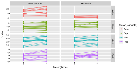<!-- --> --- # Spaghetti Plot I want to highlight a piece of the code before. ```r ggplot(df_long, aes(x = factor(Time), y = Value, group = interaction(Variable, nam) , color = factor(Variable))) + geom_line(alpha = .7) + geom_point(alpha = .7) + facet_grid(Variable~show, scales = "free") ``` Note the: - `interaction(Variable, nam)` - `Variable~show` in the `facet_grid()` function -- `interaction()` let's us group by more than one variable. Why would we want to do that here? `Variable~show` facets the plots by both variables where one is the rows (`Variable`) and one is the columns (`show`). We could have them both be the rows (`Variable+show~.`) or both be the columns (`~Variable+show`). --- # Use it 💪 ### Using the "OfficeParks" data set: - **Understand time trends** - **Find out if `awkw2` has the same problem as `awkw1`** - **Find a way to fix `awkw1` (and `awkw2` if necessary)** - **Demonstrate where there is a strong bivariate relationship (using a plot)** -- ### What did you find??